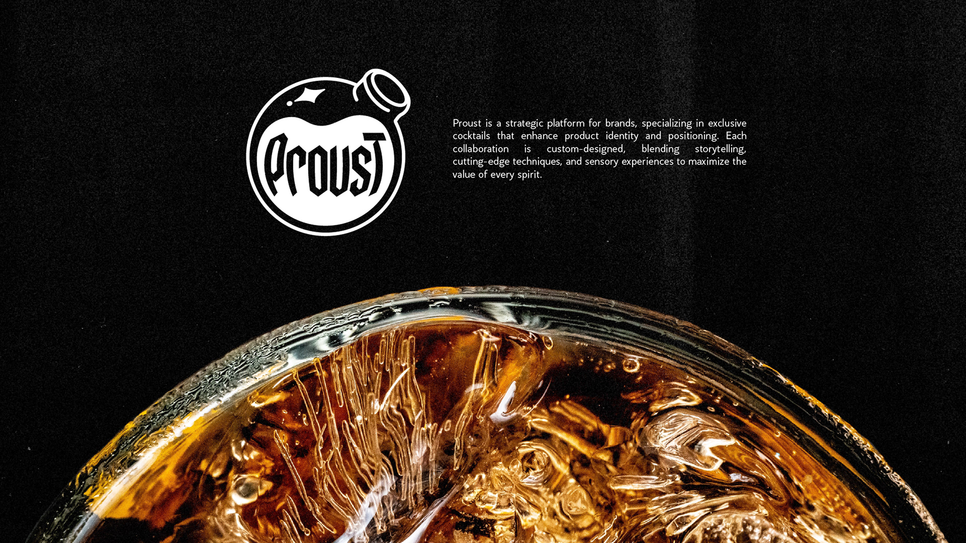
Proust came to me as a business with no name, concept or visual identity yet, a platform designing exclusive cocktails to elevate the identity and positioning of partner brands. The only starting point was an idea: cocktails built around sensory experience.
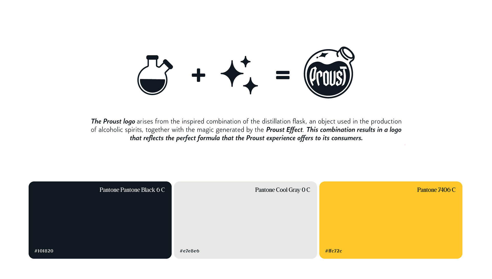
The Formula
The name and mark come from a single equation: a distillation flask fused with the spark of memory, "the Proust Effect", that involuntary rush triggered by a taste or scent. The result is an isologo that works as both symbol and signature.
Every proportion ties back to the equation
flask and memory spark, built to hold together at any size.
The System
Designed in three versions: near-black, cool gray and brand yellow, so the mark holds its legibility no matter the surface it lands on, from a dark venue wall to a printed menu.
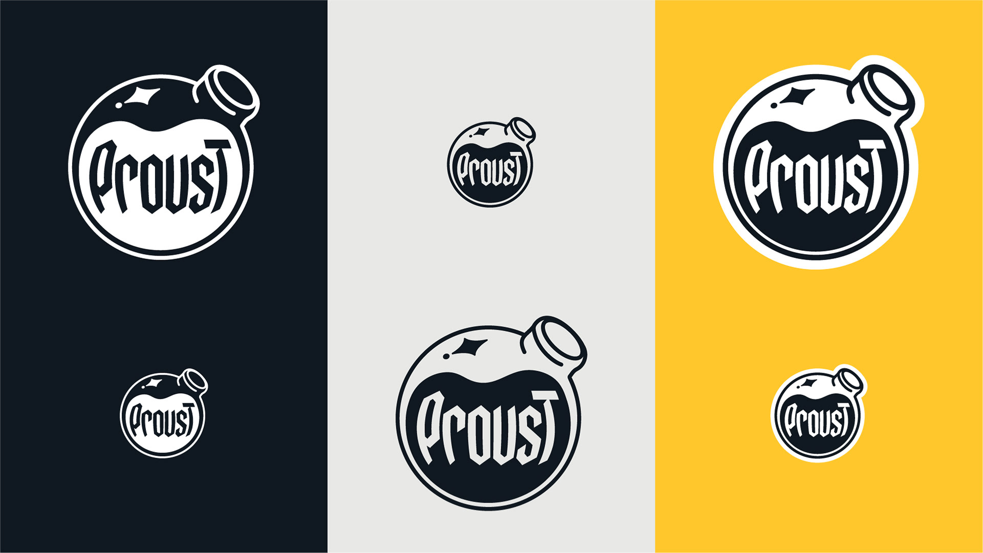
Three versions, one mark.
designed so it never loses legibility, whatever it sits on.
Built to Hold
Every proportion ties back to the equation. Reduced to a sticker or scaled up to a storefront, the isologo still reads as both symbol and signature, extending cleanly across business cards, posters and every physical touchpoint the brand needs.
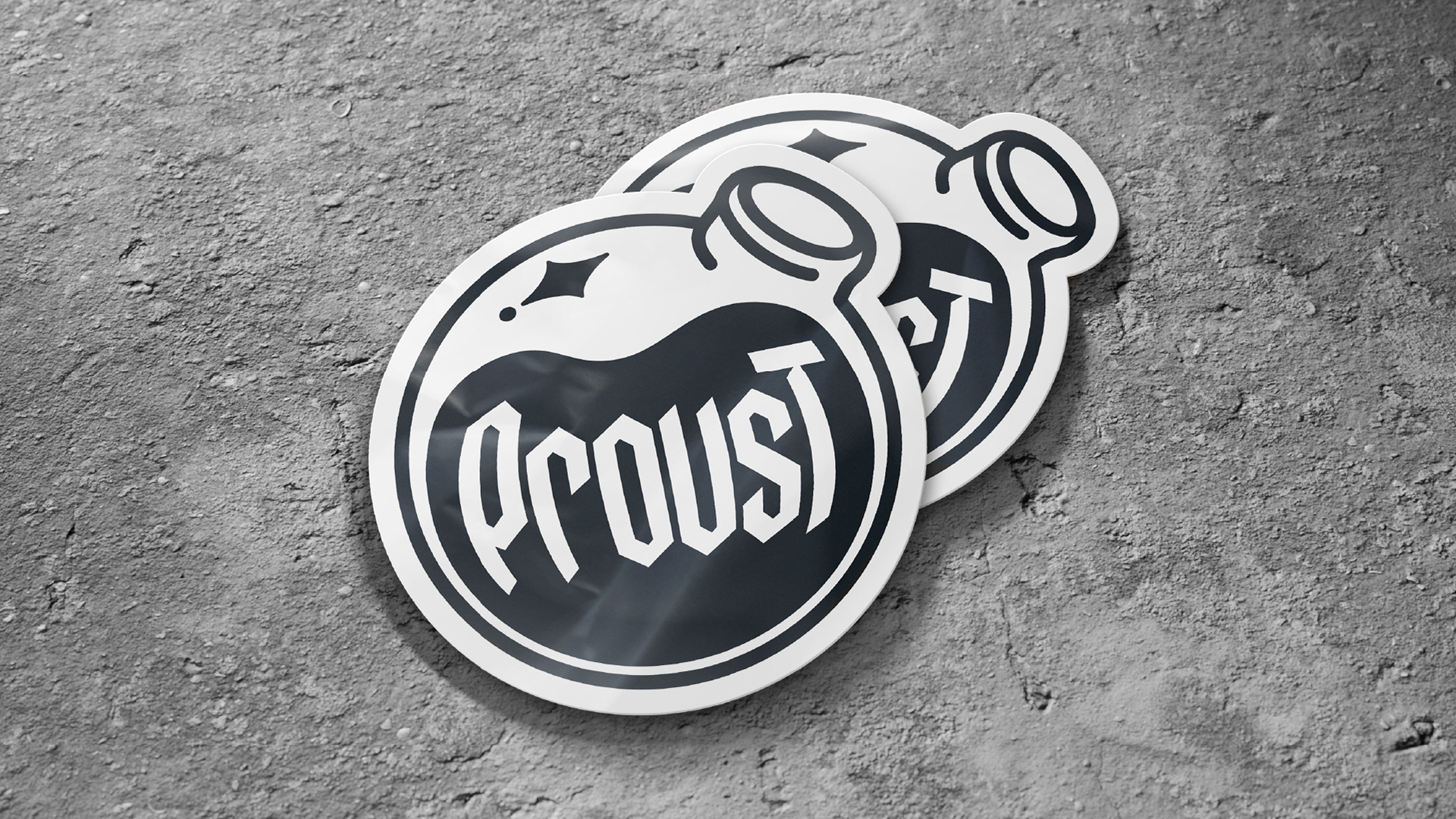
Even reduced to a sticker, the isologo
still reads as both symbol and signature.
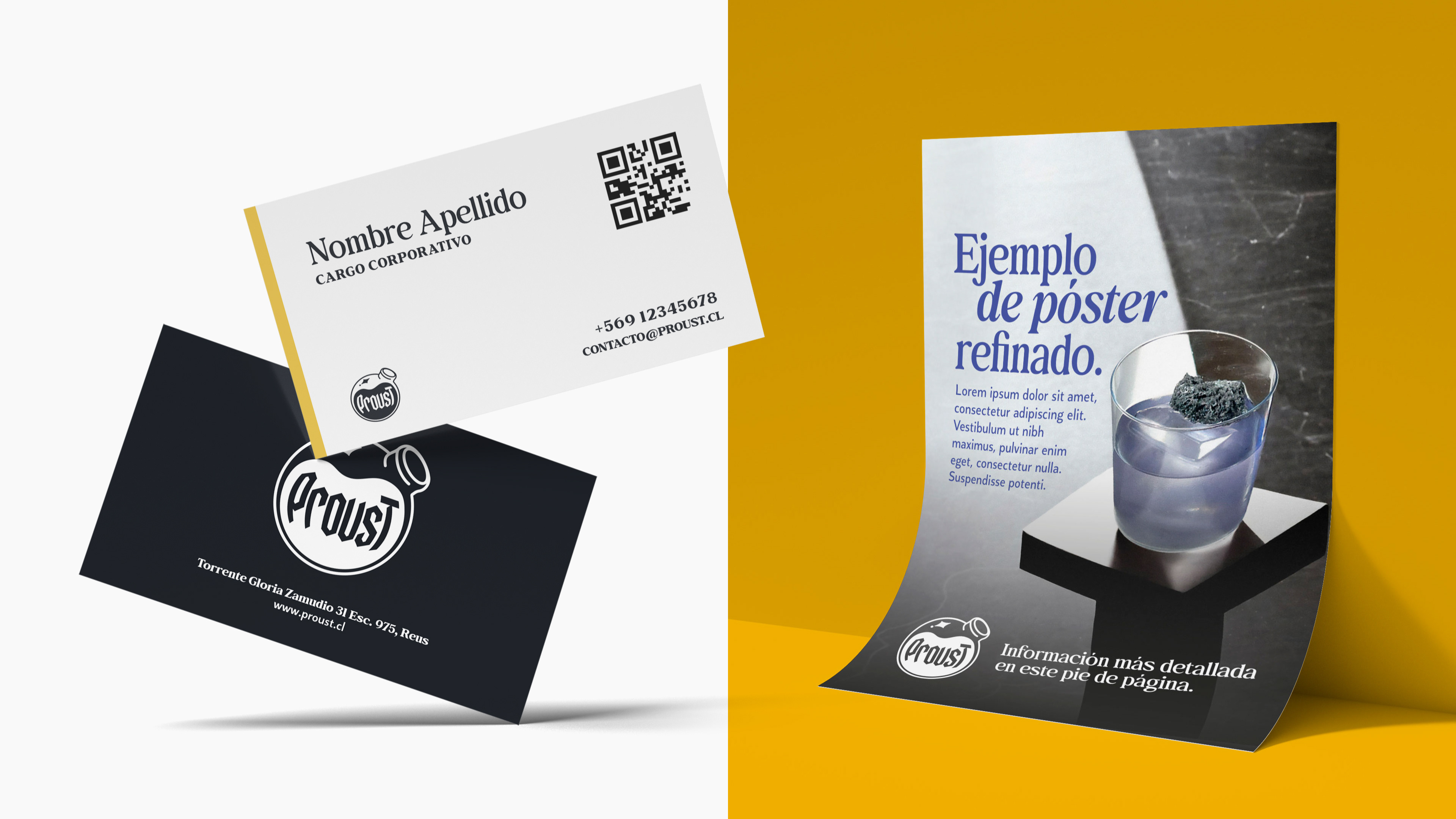
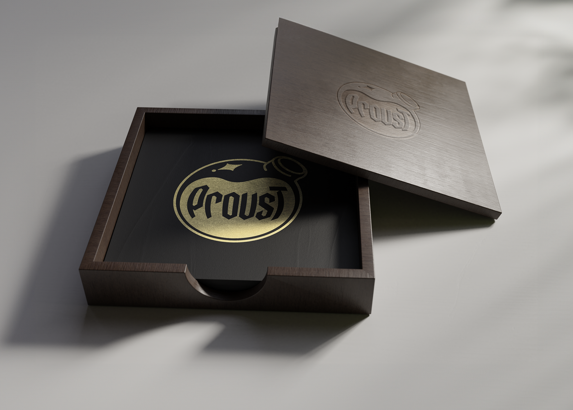
Built to live on real surfaces, not just a screen
from a business card to a poster, the mark holds its weight.
The Result
Proust launched as a real, licensed cocktail platform, adopted across Enjoy Casino's franchise network in Chile, from concept and naming to a fully deployed identity, backed by a complete brand guidelines manual.