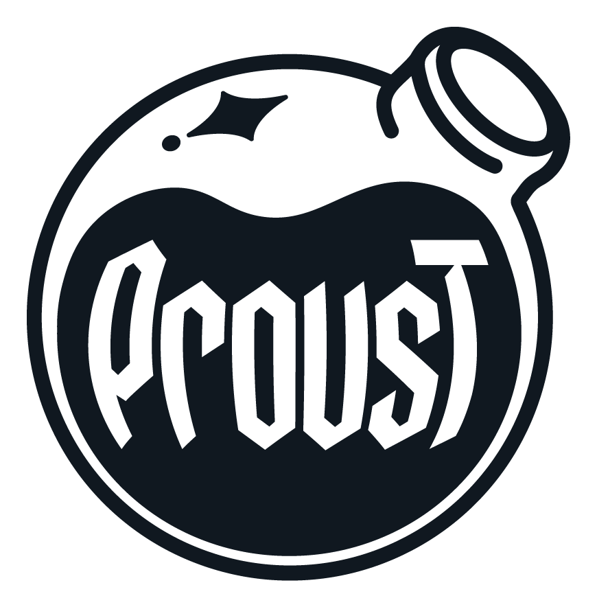
Proust — The perfect formula.
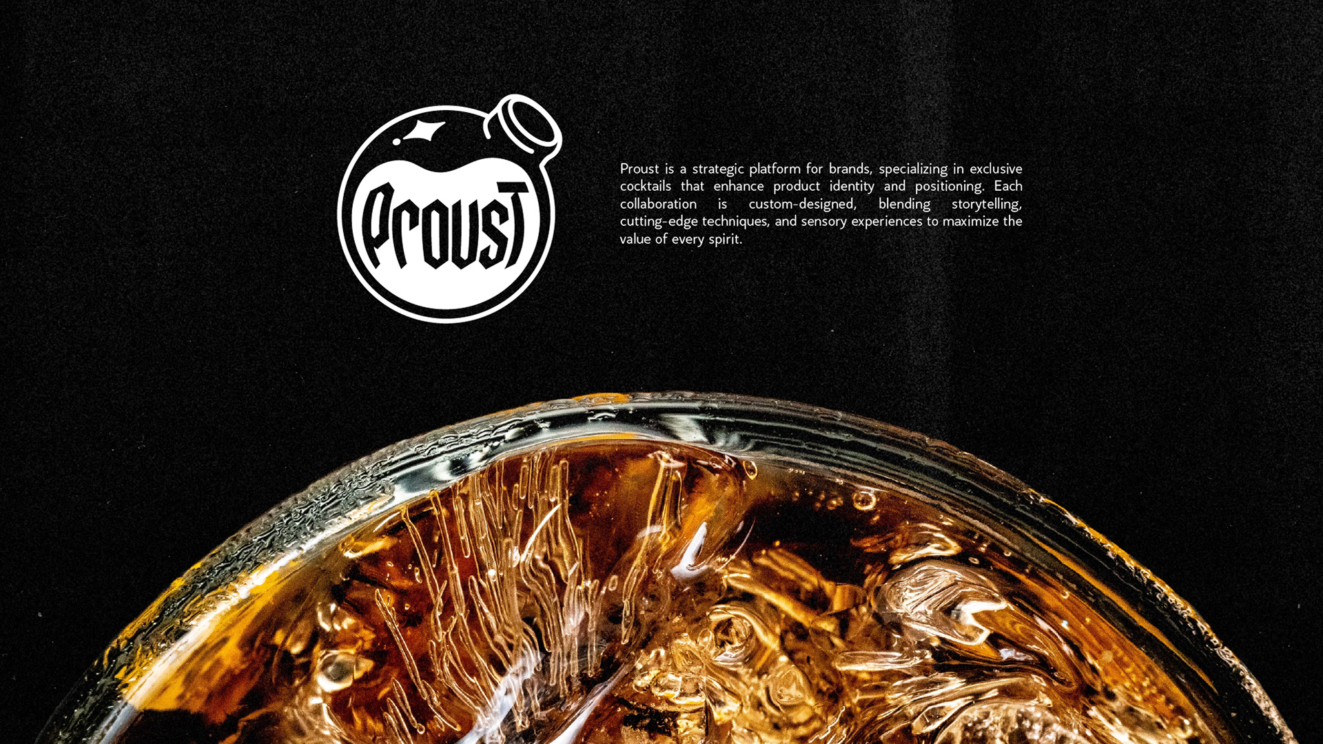
Brand identity for a strategic cocktail platform that helps brands enhance their product positioning through custom sensory experiences. The client came with the business, a platform built on sensory experience, but no name, no concept, no visual language yet. That's where this started.
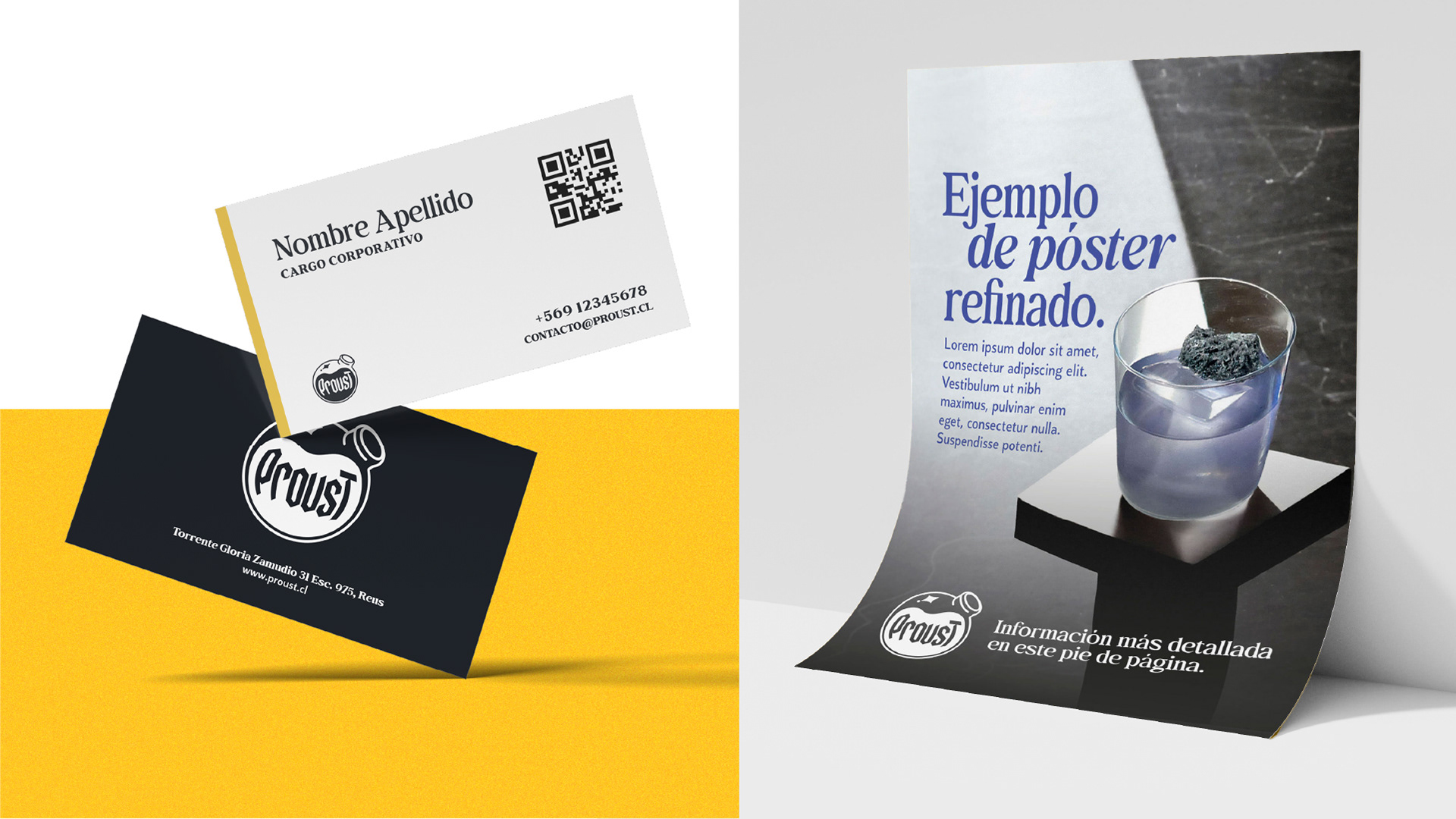
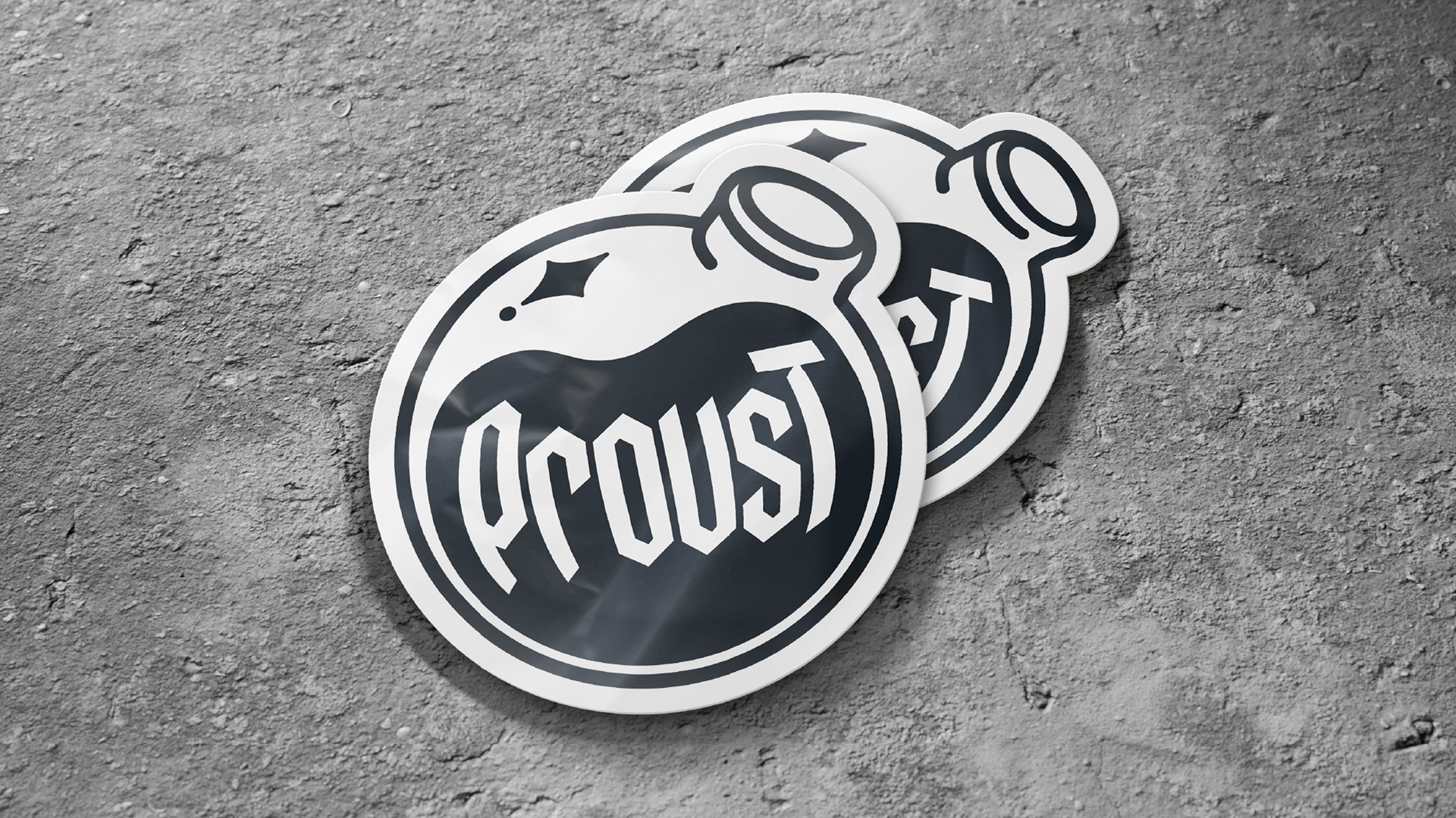
The starting point was a single equation: the Proust Effect, that involuntary rush of memory triggered by a taste or a scent, translated into a name, a story, and a mark. The result is a distillation flask fused with the spark of memory: an isologo that works as both symbol and signature, designed in three versions to guarantee legibility across every surface the brand touches.
· Branding · Naming · Conceptualization ·

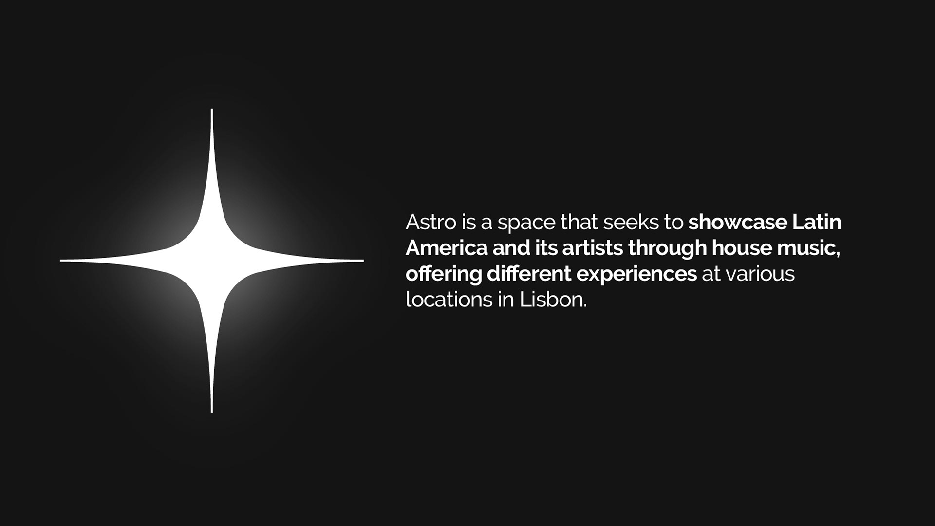
ASTRO — A bridge from Lisbon to Latin America.
A cultural project co-founded and led from scratch in Lisbon, built around a single gap: there were no spaces in the city dedicated to Latin American electronic music artists.
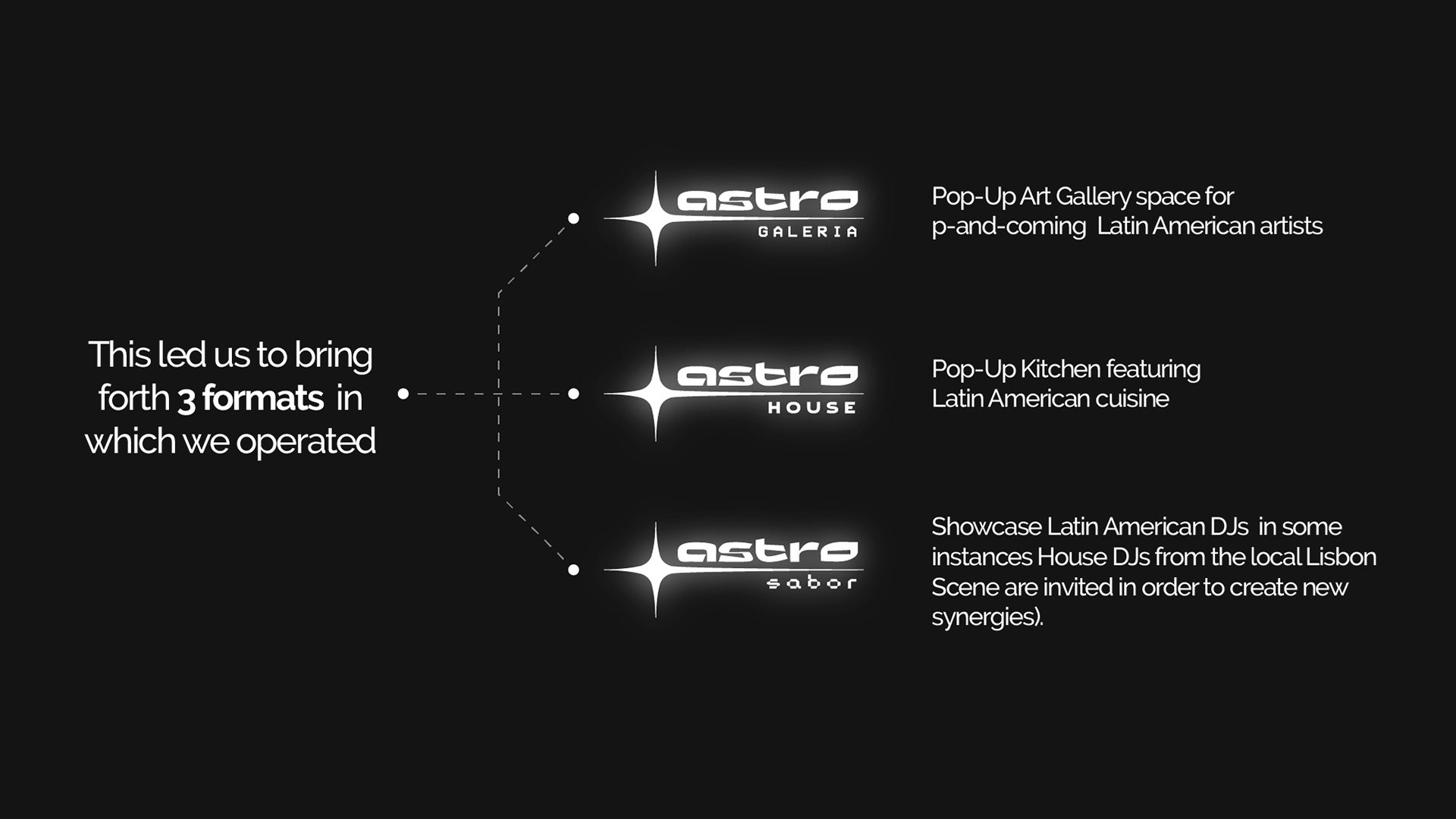
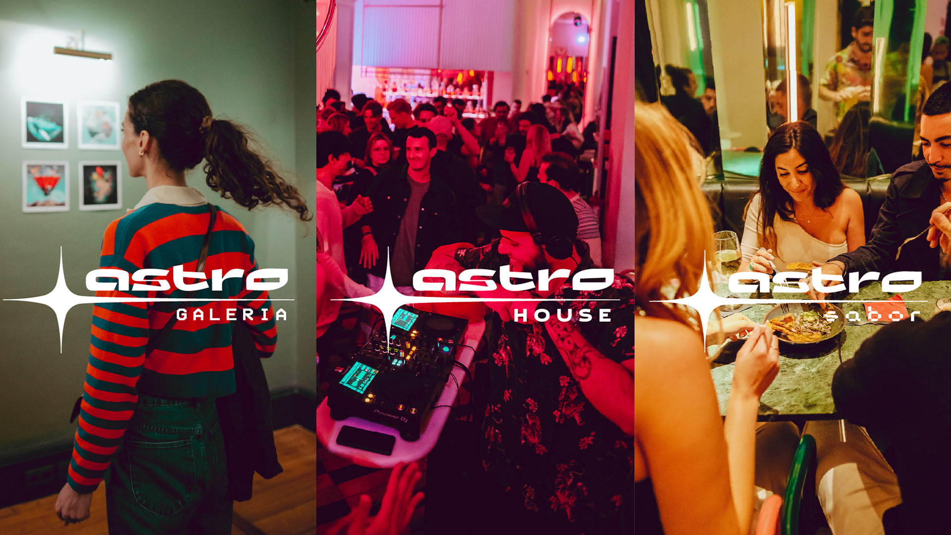
Astro, as a multi-brand, it operated across three formats: Galería, a pop-up art gallery; House, a pop-up kitchen; and Sabor, an electronic music showcase. Three distinct experiences, one shared identity.
The visual identity was designed to carry all three formats under one recognizable universe, a four-pointed star mark that communicates brightness, precision, and the idea of something distant becoming present. Across 14 events, the brand attracted between 200 and 600 attendees per event and featured 16 artists.
· Branding · Naming · Conceptualization · Creative Direction · Motion Graphics ·

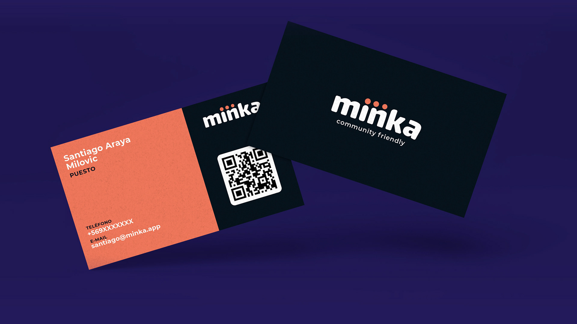
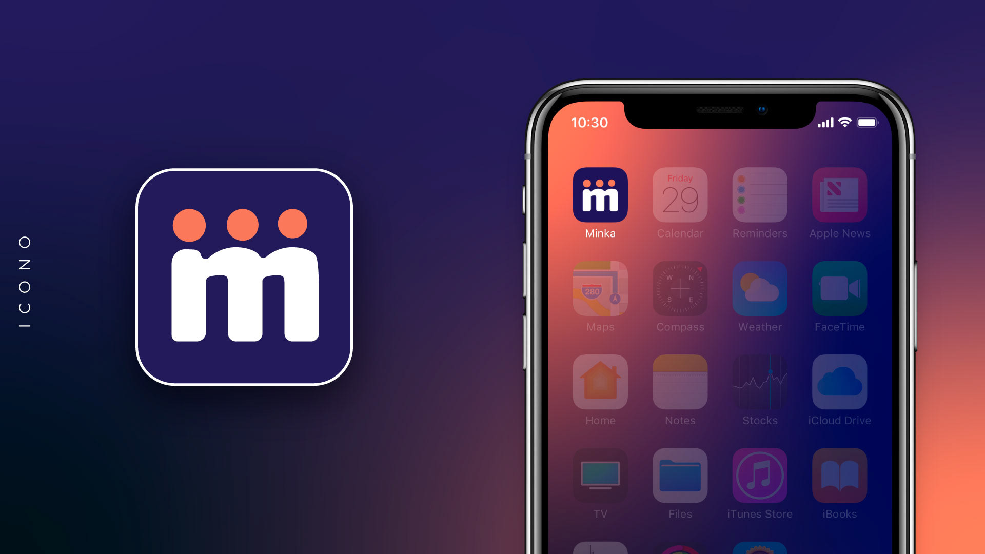
Miinka — Connecting neighbors, building community.
A brand identity for a private digital platform designed to bring neighbors together, turning proximity into collaboration. The name draws from Minka (or Minga), a pre-Columbian tradition of voluntary collective work still alive across Latin America today. A word that already meant community before the app existed.
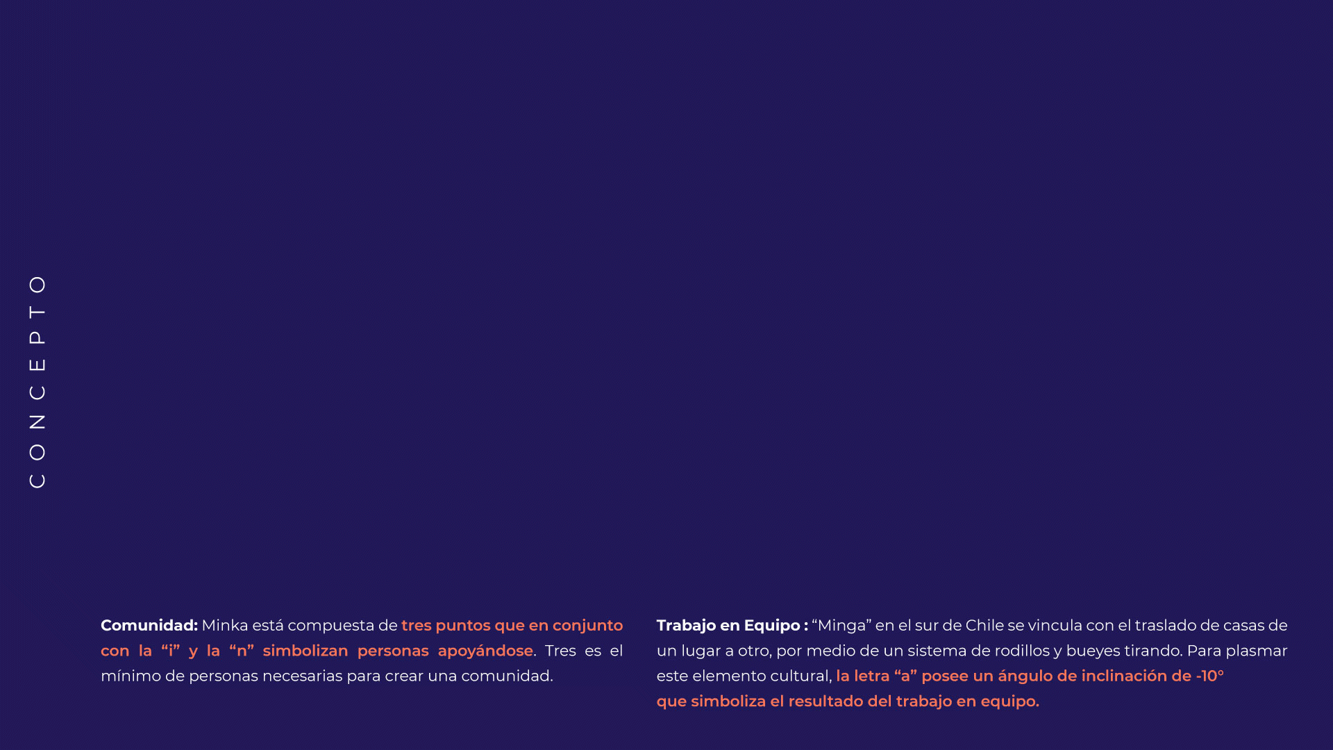
The identity is built around that same idea. Three dots alongside the i and n represent people supporting one another, the minimum needed to form a community. And the a, angled at -10°, references the Minga tradition of moving houses across land using rollers and oxen, a quiet symbol of what teamwork actually moves.
· Branding · Naming · Conceptualization ·
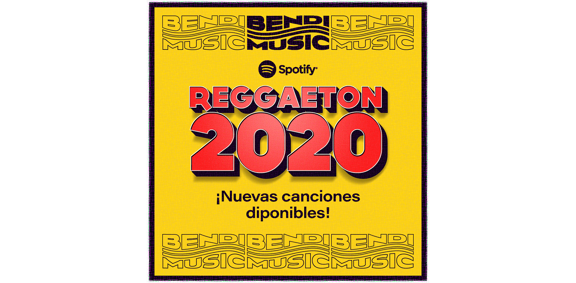
Bendi Music — The sound that travels.
Brand identity for Chile's most-listened reggaetón playlist on Spotify. The client came with a name and nothing else, no visual language, no system, no direction. The concept was built around a single insight: both music and the internet travel through waves. Two invisible forces, one shared form.
The identity translates that connection into a mark made of two oscillating waves moving in sync, instantly readable, endlessly repeatable. Designed to function as a pattern across social media assets, giving the brand a visual system as dynamic as the music it carries.
· Branding · Naming · Conceptualization ·

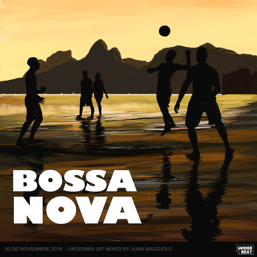
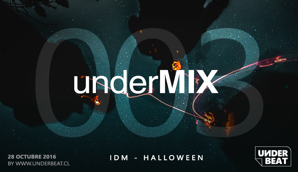
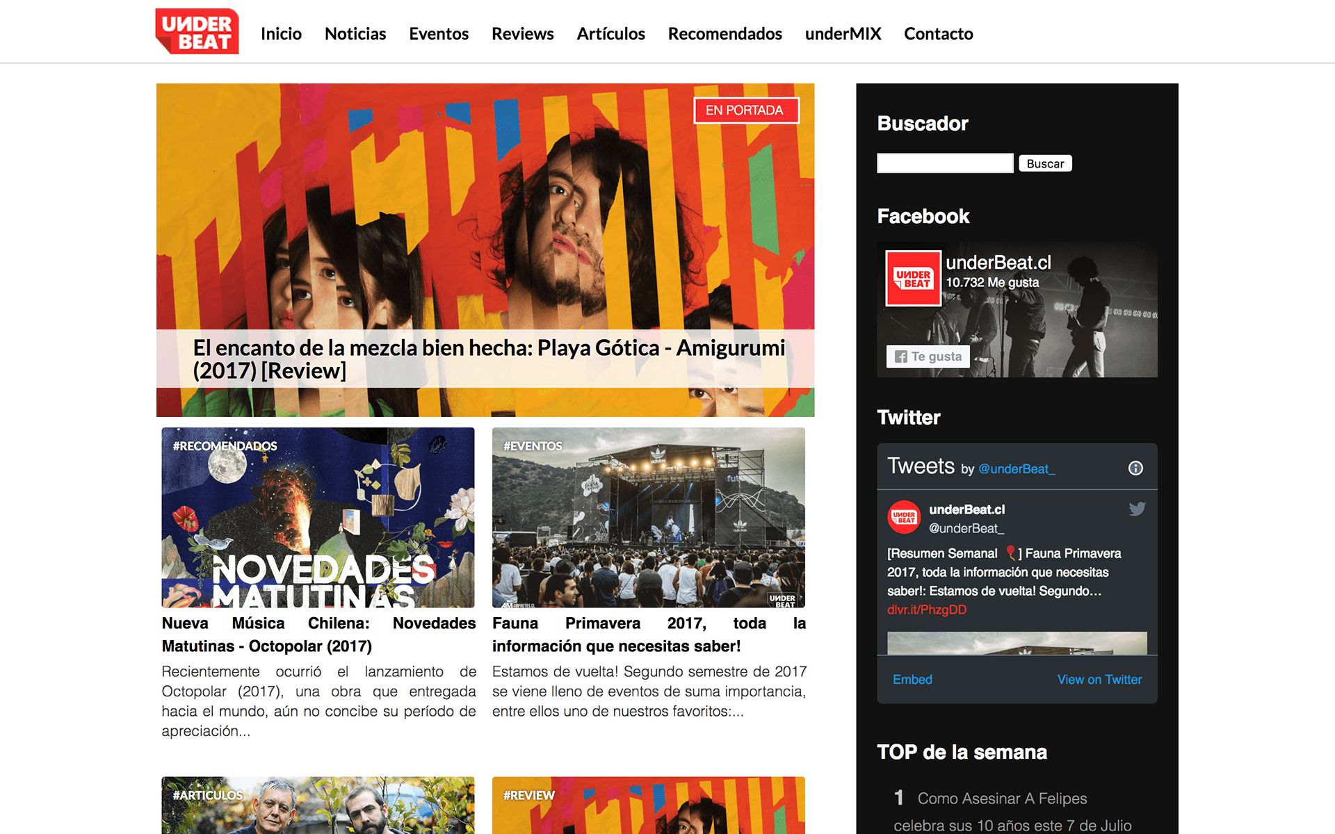
underBeat — We talk about music that deserves to be heard.
A personal project founded in 2014. A music blog born from the conviction that the most interesting genres live below the radar. The naming works on two levels: the under of underground, and the beat of the rhythm that moves you. The identity reflects that same duality, a red that doesn't ask for permission to stand out, and a detached tag hinting at what's about to be revealed.
Reached 35,000 unique monthly visitors organically, through SEO strategy alone.
· Branding · Naming · Conceptualization · Web Design ·

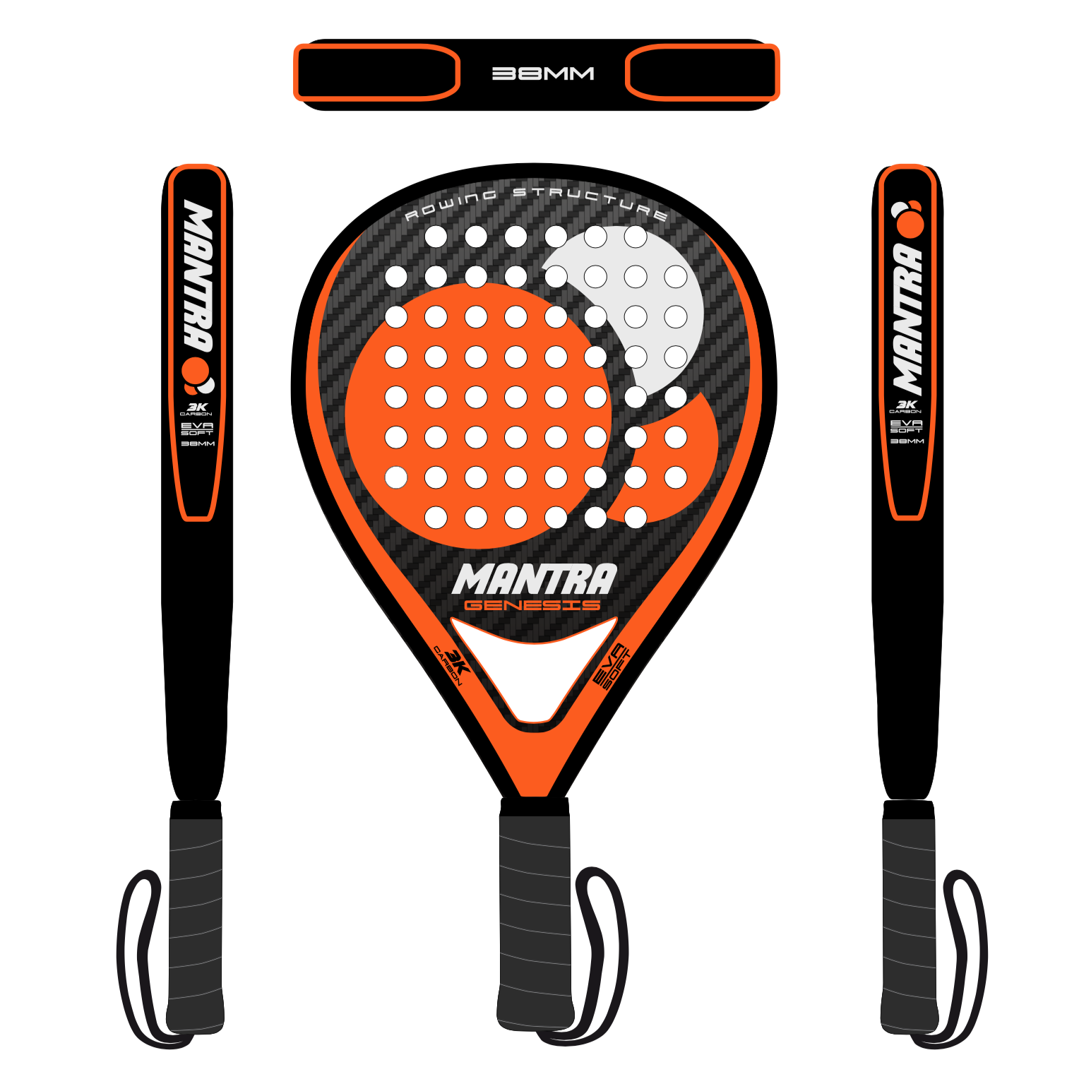
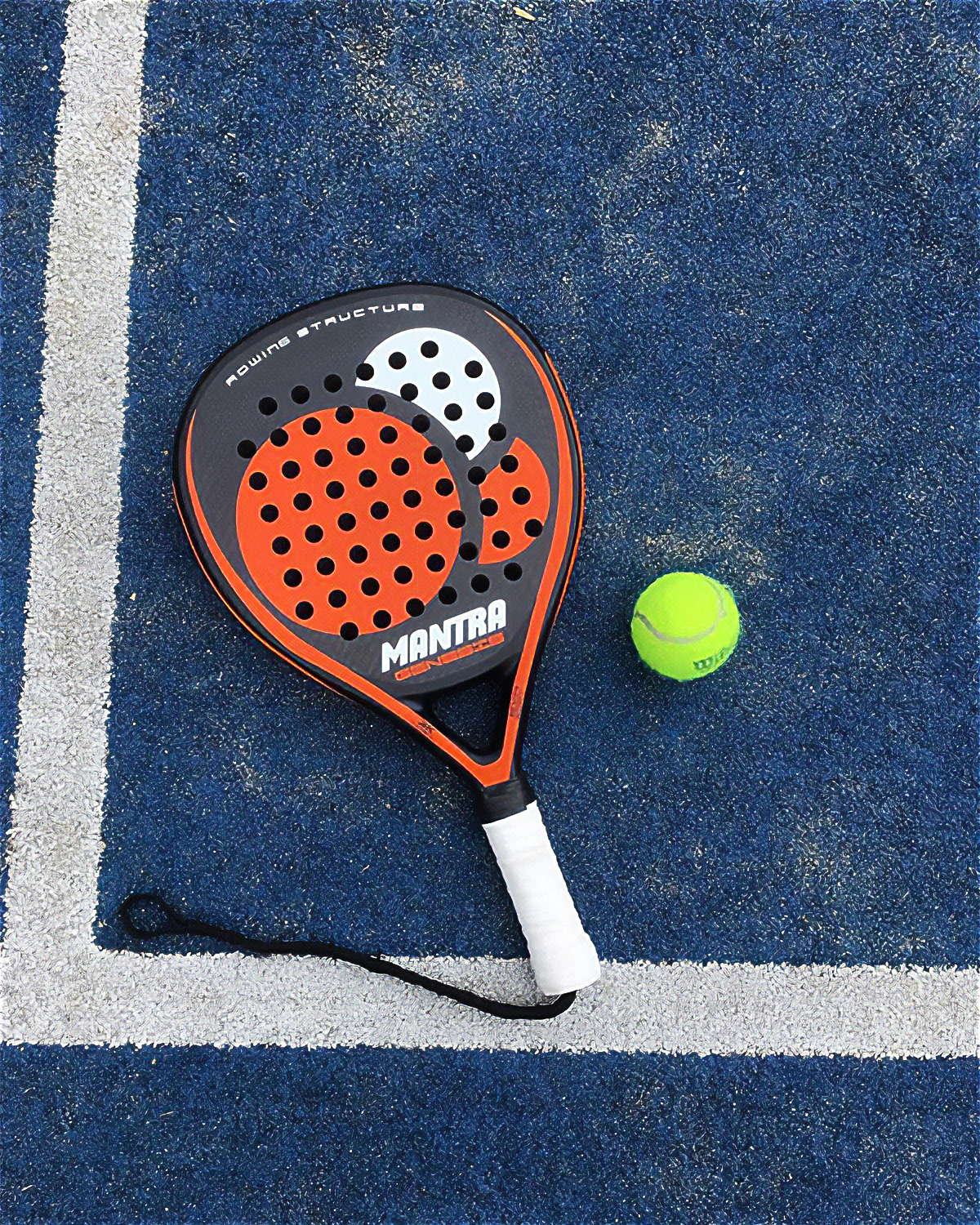
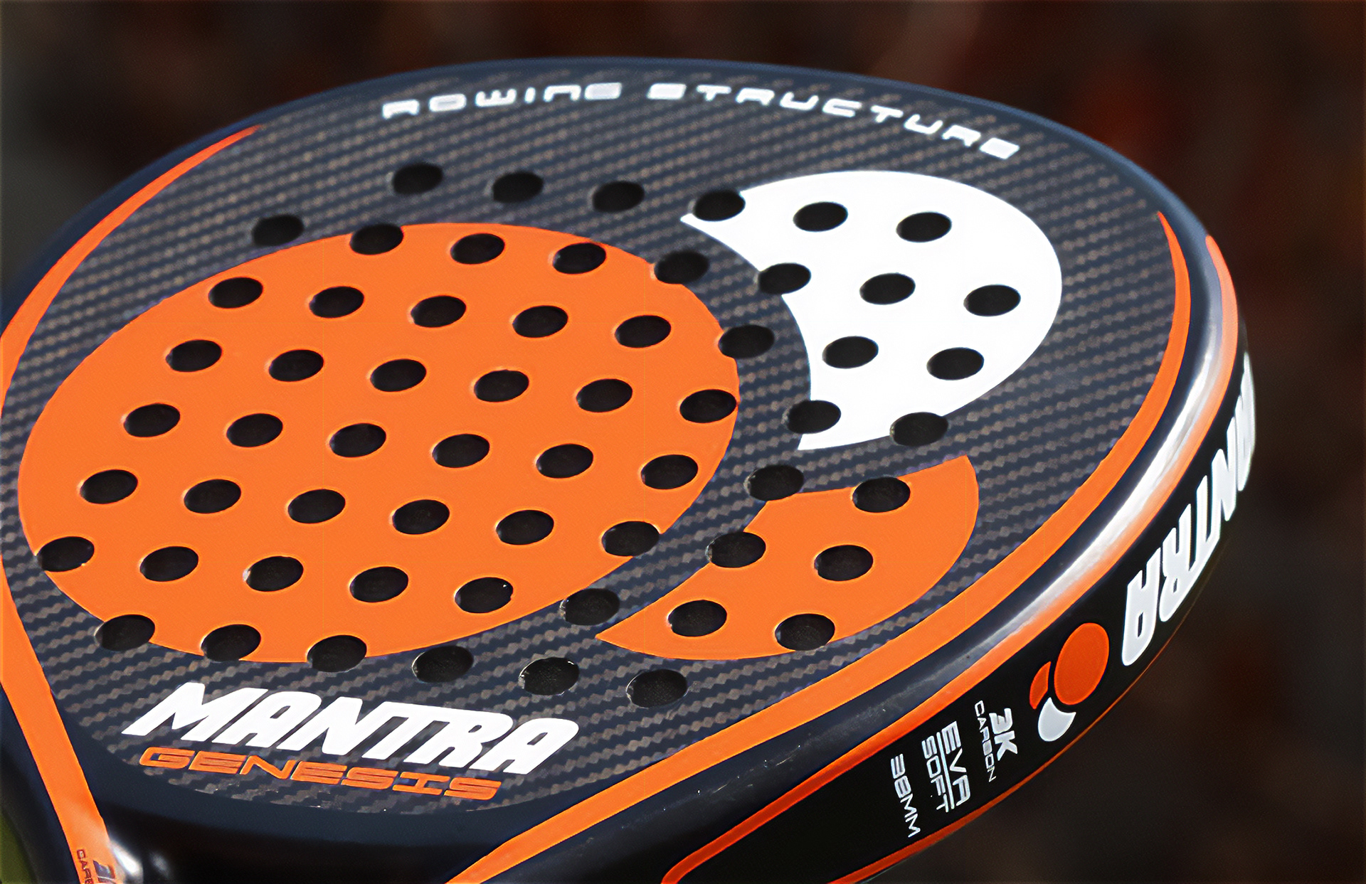
Mantra — An extension of the body.
Brand identity and product design for a pádel equipment company built around a single insight: the best players don't think about their racket — they become it. The name Mantra carries that idea in its etymology. Man = instrument, tra = mental. A mental instrument. A word that already described the product before the brand existed.
The creative rationale reframes the racket the way a driver understands a car — not as an object in your hand, but as an extension of your body. The mark reflects that energy directly: a sports-driven wordmark paired with three circles in sequence — the visual rhythm of a ball in motion, captured as a signature. The racket design itself was conceived under the same principle — form and function as one.
· Branding · Conceptualization · Product Design ·